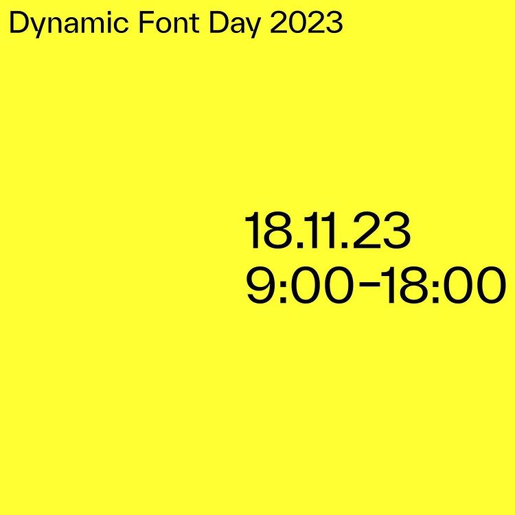
Dynamic Font Day 2023
 LocationMünchen, Germany
 AttendanceIn-person and Online Event
 Travel
 About Dynamic Font Day 2023
Dynamic Font Day showcases the latest highlights in typography beyond print.
Dynamic Font Day presents the newest developments in typography beyond print. This year's topics include 3D typography, digital media accessibility, parametric type design, and generative design and AI. Speakers consist of distinguished global specialists like Ann Bessemans (Hasselt University), Kimya Gandhi (Mota Italic), Akiem Helmling and Bas Jacobs (Underware), Philipp Koller (burrowlab), Sabina Sieghart (READSEARCH), Tina Touli, Vincent Wagner, and Daniel Wenzel (DIA Studio). Dynamic Font Day 2023 provides a chance to discover new methods, get valuable ideas, and have engaging discussions. The event will occur at the Deutsche Meisterschule für Mode / Designschule Munich - but there will also be an online stream of the talks. Last year, we sold out completely - so reserve your ticket now!
 Speakers
Ann Bessemans speaks about Visual Prosody
Visual Prosody
Communication goes bad when it lacks social connectedness. Speakers who make eye contact, proper voice inflections are more effective communicators. Speaker effectiveness is guaranteed by speaking emoting and expressively with people, versus dryly. Type is not as expressive as our voices. With our voices we can say particular words softer or louder, mumble them, or shout them, dwell for an extra beat on a fascinating idea, or raise your pitch to express excitement. With rare exception, the words in a composed sentence are completely uniform in weight and size, as if to convey a monotone. The monotone of type leads to problems in reading comprehension. Who hasn’t had the experience on their email being misinterpreted because the receiver didn’t hear the tone in your voice as you wrote it?
In the creation of a tool to teach kids how to read expressively, we have already come a long way. Our creative artifacts comprised volume, duration, pitch and pause of speech prosody to assist in reading aloud but also for indicating important units of a sentence while preserving a natural reading (aloud) in general. We were able to show that we can improve the reading aloud as well as the comprehension if we visualize prosodic variation. And just like making prosody visual, emotions have the potential to become visualized within a text as well.
This talk will investigate what we can do to make type more expressive and emotive, and report on studies.
 Kimya Gandhi
Learn more about Kimya Gandhi
Kimya Gandhi is a type designer from Mumbai, currently living in Berlin. Specialising in designing Devanagari typefaces, Kimya draws her inspiration from India’s rich and diverse visual landscape and hopes to create new and innovative designs for Indic scripts. Kimya is a partner at the type foundry Mota Italic where she along with Rob Keller designs custom and retail typefaces for clients from various parts of the world. When not drawing typefaces she spends her time teaching, or conducting workshops on typography and type design at various design institutes. Other than letters, she likes cooking, plants and the colour black.

Kimya Gandhi speaks about Pushing boundaries of Devanāgarī type design
Pushing boundaries of Devanāgarī type design
to be announced
 Akiem Helmling & Bas Jacobs
Learn more about Akiem Helmling & Bas Jacobs
Zealotry wouldn’t be an inappropriate collective noun for Underware. They not only design typefaces, they live type—they educate about type, they publish about type, they talk about type, they want (and organise) others to talk about type. There is an inherent honesty to their enthusiasm that betrays no snobbery—they simply think that type is very interesting and that everyone, given the chance, might think so too. Their work is among the most popular of independent type foundries — happy-go-lucky, high-quality, text-friendly typefaces for both display use and comprehensive typesetting. Underware’s typefaces stand out thanks to unique aesthetics, finished quality, and a considered collective presence. Underware is a refreshing and intelligent type foundry who, while taking what they do seriously, manage to not take themselves too seriously. (Is Not Magazine about Underware)
Akiem Helmling & Bas Jacobs speaks about Look backward, write forward
Look backward, write forward
›Look backward, write forward‹ is a concept that encourages reflection on the past as a source of inspiration and insight for the future. When you look backward, you can draw from your experiences (and those of others), learn from your mistakes (and experiences), and build upon the stuff we know to inform the stuff we do not know yet.
While this approach can be applied to various aspects of life, including personal growth, decision-making, and creative endeavors, it becomes especially fascinating within writing. While Gutenberg’s invention evolved out of chirographical writing back then, any possible new kind of writing (like grammatography) is leaning consequently on typography and chirography).
 Philipp Koller
Learn more about Philipp Koller
Philipp Koller is a graphic designer, web developer, and parametric type-design researcher. After completing his Bachelor’s Degree in Visual Communication from the University of the Arts in Berlin in 2017, he became one of the founding partners of Burrow Berlin, a design studio focusing on the cultural field and specialised in identity, print, exhibition, and web projects. Additionally, since 2022, Philipp Koller is the author, creator, and developer of a type tool named Burrowlab, which focuses on reimagining type in various aspects. For the application, he conceptualizes, designs, and codes prototypes that challenge traditional type design paradigms by offering a parametric approach.
Philipp Koller speaks about Parametric Type
Parametric Type
Looking at prototypes of a type tool that emphasises the creative aspect of type design and distributes all kinds of typographic styles across a selected glyph set.
The concept deviates from the linear development in digital type and follows a long tradition of line/skeleton drawing as opposed to outline drawings.
Designers can play with the intuitive interface and preview design concepts applied to a comprehensive letter set in real-time. With the possibility of running subroutines on the initial skeleton line or the outline, the final result can be manipulated with customised scripts, leaving a lot of room for imagination. Each state within the font can transition to another, making the displayed typeface literally variable and fully dynamic.
In contrast to variable font, parametric or procedural type is not trimmed by a minimum or maximal values, which can lead to interesting effects by overdriving values. Bugs, glitches and surprises are welcome and sometimes inspire further development.
Ann Bessemans speaks about Visual Prosody
Visual Prosody
Communication goes bad when it lacks social connectedness. Speakers who make eye contact, proper voice inflections are more effective communicators. Speaker effectiveness is guaranteed by speaking emoting and expressively with people, versus dryly. Type is not as expressive as our voices. With our voices we can say particular words softer or louder, mumble them, or shout them, dwell for an extra beat on a fascinating idea, or raise your pitch to express excitement. With rare exception, the words in a composed sentence are completely uniform in weight and size, as if to convey a monotone. The monotone of type leads to problems in reading comprehension. Who hasn’t had the experience on their email being misinterpreted because the receiver didn’t hear the tone in your voice as you wrote it?
In the creation of a tool to teach kids how to read expressively, we have already come a long way. Our creative artifacts comprised volume, duration, pitch and pause of speech prosody to assist in reading aloud but also for indicating important units of a sentence while preserving a natural reading (aloud) in general. We were able to show that we can improve the reading aloud as well as the comprehension if we visualize prosodic variation. And just like making prosody visual, emotions have the potential to become visualized within a text as well.
This talk will investigate what we can do to make type more expressive and emotive, and report on studies.
 Sabina Sieghart
Learn more about Sabina Sieghart
Sabina Sieghart is a designer, lecturer, and design researcher. She has been working for 25 years in the industry on high-profile corporate design projects. Since 2003 Sabina has been teaching typography and editorial design. In 2016 she started her career as a design researcher and is currently a PhD candidate and FWO fellow at READSEARCH in Hasselt, Belgium. As a DIN (German Institute for Standardization) committee member, she is substantially responsible for the formulation of the visual guidelines of the DIN SPEC 33429 Leichte Sprache (easy-to-read language).
Sabina Sieghart speaks about Design matters: Usage of digital media by Easy-to-read audience
Design matters: Usage of digital media by Easy-to-read audience
Shading some light into the blackbox of users with cognitive impairments.
Easy to read (ETR) is a tool for simplifying text. While Covid has given a huge boost to digital ETR products, we do not know enough about how the target group – people with low reading ability due to intellectual disabilities – interact with digital media.
Linguistic and social sciences have long neglected the contribution of well-crafted typography and User Interface design to text comprehension. Design research in this area is scarce, yet it is the only way to improve the sometimes dysfunctional guidelines and thus improve the reading experience for this target group.
Designer and design researcher Sabina Sieghart (currently a PhD student at READSEARCH, Belgium) will present a study that observed the interaction of 20 German ETR users with PDF and HTML documents designed according to WCAG guidelines. We see how ETR users navigate in digital media, which digital design patterns they use, and their (often visual) workarounds to compensate for their low reading skills.
 Tina Touli
Learn more about Tina Touli
Tina Touli is a London-based creative director and graphic communication designer. Her work has taken her around the world, presenting at speaker panels, festivals and conferences such as the Adobe MAX, the OFFF Festival, the Graphika Manila, the FITC Amsterdam and the Typomania Festival. Her multidisciplinary approach has given her the opportunity to work with a variety of clients, such as Adobe, Dell, HP, Ciroc Vodka, Fiorucci, Tate, Converse, Oppo, Kappa, Glo, Dropbox and LinkedIn. She was selected by Print Magazine as one of the 15 best young designers in the world, aged under 30 (2017). Her work has been featured in Communication Arts magazine, Computer Arts magazine, Digital Arts magazine and Creative Review blog among others, and design publications such as »Design{h}ers« by Viction:ary. She is an educator (Central Saint Martins, University of Arts London) and hosts online courses.
Tina Touli speaks about Reimagining Reality
Reimagining Reality
Within our immediate surroundings lies a vast reserve of inspiration that often goes overlooked, despite its potential to infuse our work with boundless creativity. It is all about training our eyes to perceive the world through a different lens, igniting our creative potential and unleashing innovative solutions. Exploring the ordinary from extraordinary angles, reimagine the world that we live in.
 Vincent Wagner
Learn more about Vincent Wagner
Vincent Wagner is a freelance 3d artist, experimental typographer and 3d type designer, based in Vienna. With a background in law, his professional life had to take a couple of odd turns for him to arrive at the intersection of type and 3d. From a short stint at studying architecture, via law studies, business-side work in the music industry and boring sales jobs in media agencies, to night school for graphic design, going freelance and inching his way towards a specialization in type and 3d, it’s been a fun ride. For the last couple of years, Vincent had the chance to hold workshops at Universities (SVA, HSBI), speak at typography conferences (TDC Type Drives Culture 2022, Inscript Experimental Type Festival 2022) and work on projects for clients like Twitch, RedBull, Squarespace and Island Records. His current focus on 3d typefaces has led to founding type.computer [https://type.computer/], an experimental 3d type foundry, with the goal of spreading the love for 3d type.
Vincent Wagner speaks about 3d typography — between surface and substance
3d typography — between surface and substance
3d typography and lettering are all around us today. It is a trend, but it could perhaps be much more than that. Beyond the surface of 3d effects lies the potential for a meaningful use of the third dimension. And there is a lot of fun to be had, playing around with type in three axes.
The current lack of specific tools, both for the creation and for the use of 3d typefaces, makes this field difficult to get into for many designers. But I believe it is precisely the wide-spread experiment that will confirm or disprove any long-lasting potential of 3d typography beyond the ongoing hype.
In this talk I want to give an overview of my understanding of 3d type, show examples of design and use and present accessible ways to start experimenting with typography in digital space.
 Daniel Wenzel
Learn more about Daniel Wenzel
My name is Daniel Wenzel. I am a procedural designer specialized in typography and generative processes. I studied communication design in Konstanz, Germany. Halfway through university I paused my studies to work at DIA Studio in New York. I later returned to Germany to continue and complete my studies, but stayed at the studio remotely. During university, I began to create a growing archive of typefaces and type experiments, which over time evolved into a small type foundry called 26A1. In March 2021, I started as a part-time University Lecturer at ELISAVA in Barcelona, in Typography in the Master Visual Design. I have since taught and lectured at a variety of universities and design events. In September 2021, I finally moved back to Brooklyn, as a full-time Senior Art Director at DIA studio.
Daniel Wenzel speaks about Procedural Typography
Procedural Typography
Exploring the influence and transformative power of technology in design, while shedding light on the synergy between tools, generative design, automation, and AI.
Procedural or Generative Design goes beyond mere computer graphics – it represents a process, a methodology, crafting rules and constraints that guide the design process.
With the progression of automation and AI comes a rapidly changing design landscape that no longer allows us to rely on a single tool. Versatility and adaptability are becoming a key component of our job.
AI can be utilized as an assistive tool, that can play a crucial role in the design process, from concept visualization to execution. More and more tasks are left to machines in order to make better use of the human potential. This allows designers to focus more on conceptualization and less on execution raising the importance of creativity and originality.
 Price
Price
Get Your Ticket
 Venue
Venue
Deutsche Meisterschule für Mode / Designschule München
Sendlinger-Tor-Platz 14
80331, München
Germany