Yeah! I won a ticket to TYPO Berlin!
Day 1
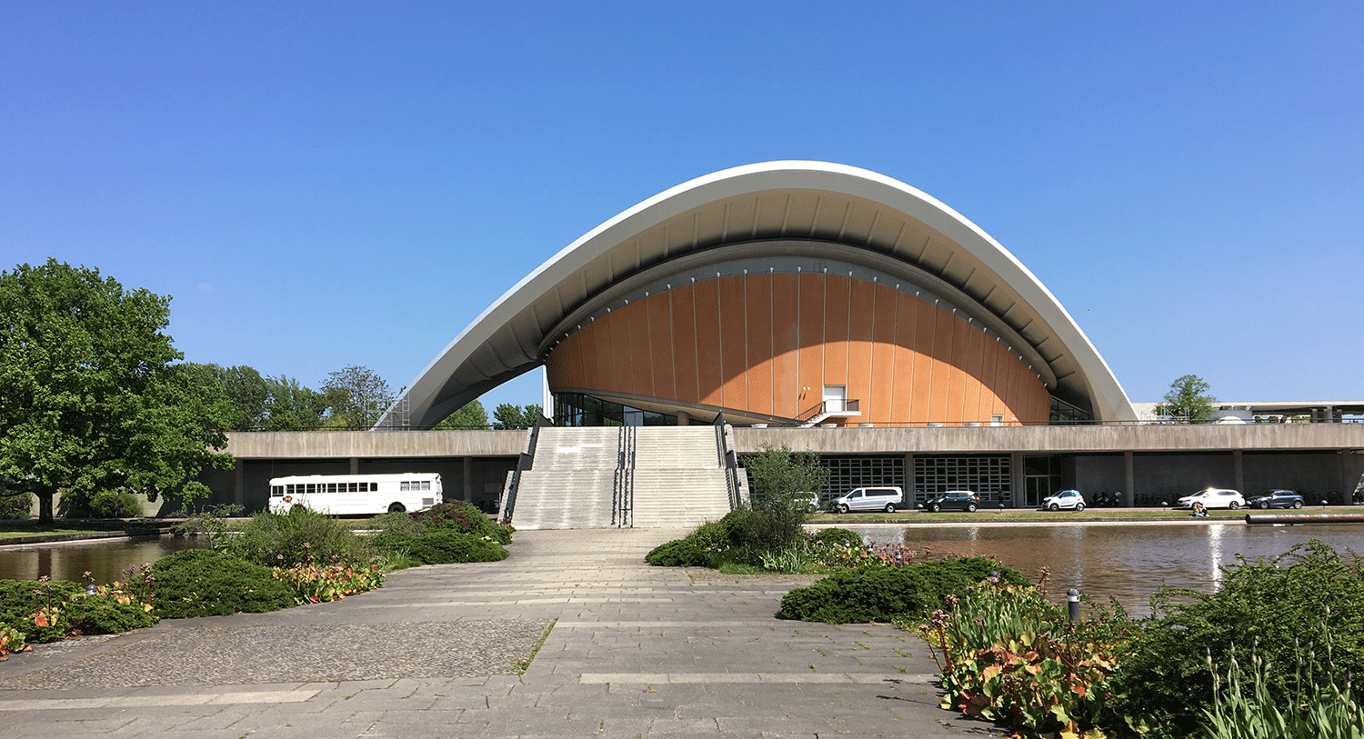
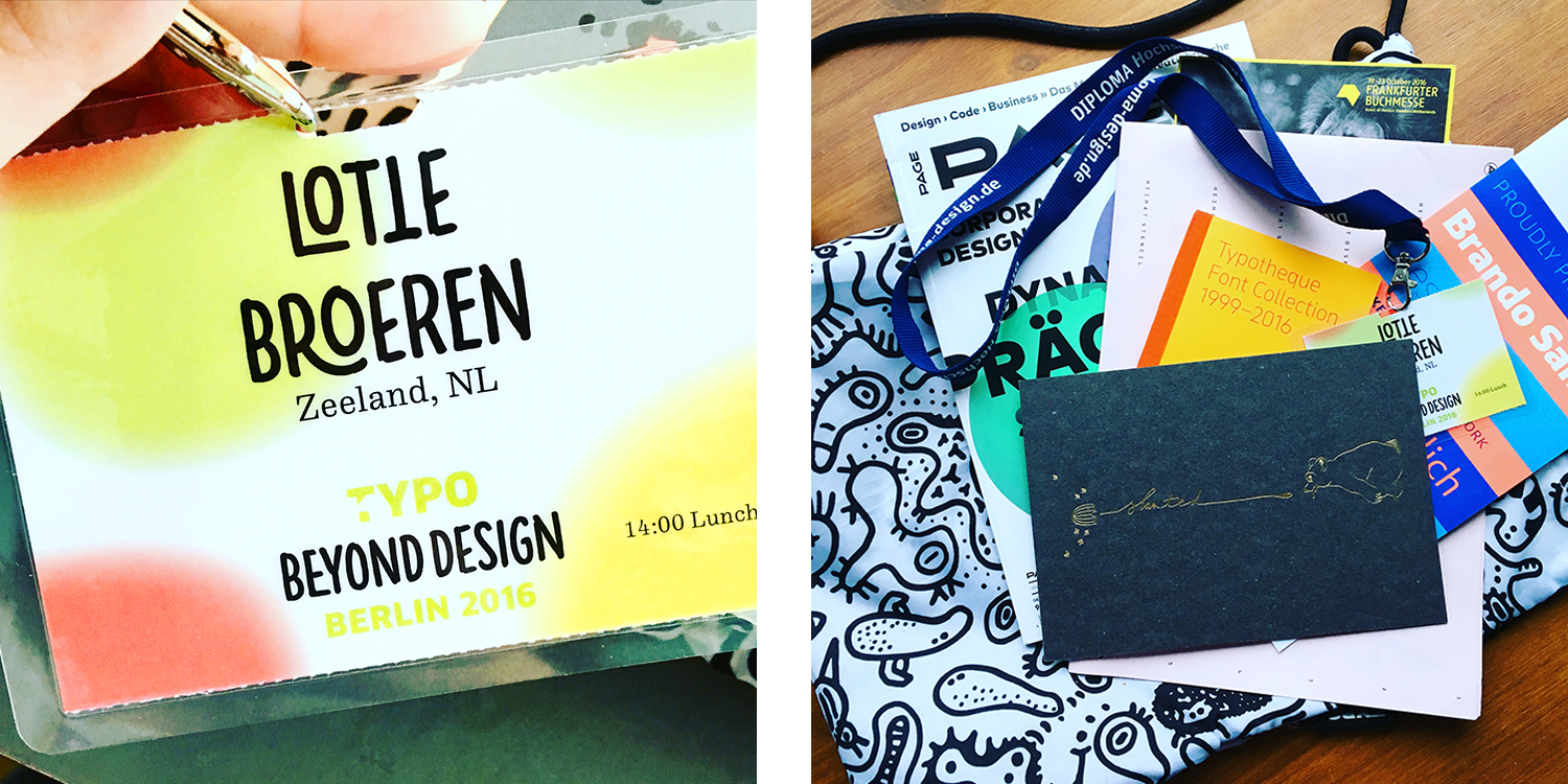
The first day started at 2 p.m. Outside of Haus der Kulturen der Welt nothing gave away that TYPO Berlin was going on. Inside the BeyondTYPO font was everywhere. The nametag I got at my registration doubled as entrance ticket. A pre-set time for lunch was printed on the tag to avoid queues: good idea!
In the programme guide was a floor plan but unfortunately it wasn’t very clear, nor was the black signing they taped on the dark blue floor.
Maria Giudice gave the opening speech. She spoke about The rise of the DEO (Design Executive Officer). DEO is another way of leadership, a different mindset, a co-creator. It’s about collaborating and GET SHIT DONE! The entire audience agreed with her list of tips to improve the ambiance on the workfloor:
- Being positive to co-workers is important: having fun at work increases productivity.
- Embrace creative chaos
- Take a short break every 90 minutes to free your mind
- Misfortunes make people / companies stronger
Mr Bingo was next. He started his talk with the words: “My existence is simple — I try to amuse.” And he did. I had a smile on my face the whole talk. He is an illustrator and artist, made a rap video and gets paid to send hate mail. Evidently he loves what he is doing and that was transferred to the audience. It was a very motivating and inspirational talk.
Next Niko Kitsakis was on: How learning Japanese helped me to look at things differently. Niko discussed the differences between the Japanese and English language. English is made up of letters but Japanese contains characters that each have their own meaning. Different characters together make a new word, a new meaning. Think about the word ‘conclusion’. When you read it in English you know what it means but that’s it. In Japanese the word ‘conclusion’ is made out of two characters; ‘tie up’ en ‘argue’. If you tie up argument, you get a conclusion!
During the afternoon rooftop coffee break I met Ridad Alem, a graphic designer from Saudi Arabia. I found it interesting to see that even if you live miles apart and come from totally different cultures, you all have something in common. As Ridad said: “What I love most about the conference is the variety of topics and speakers that come from many disciplines, cultures and backgrounds.” I couldn’t agree more.
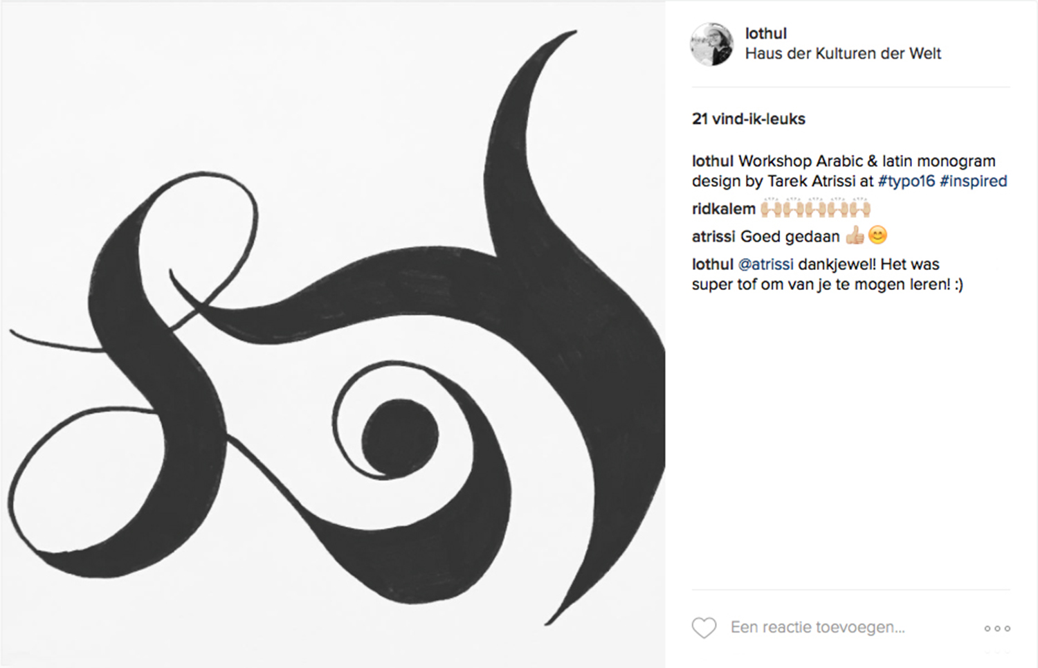
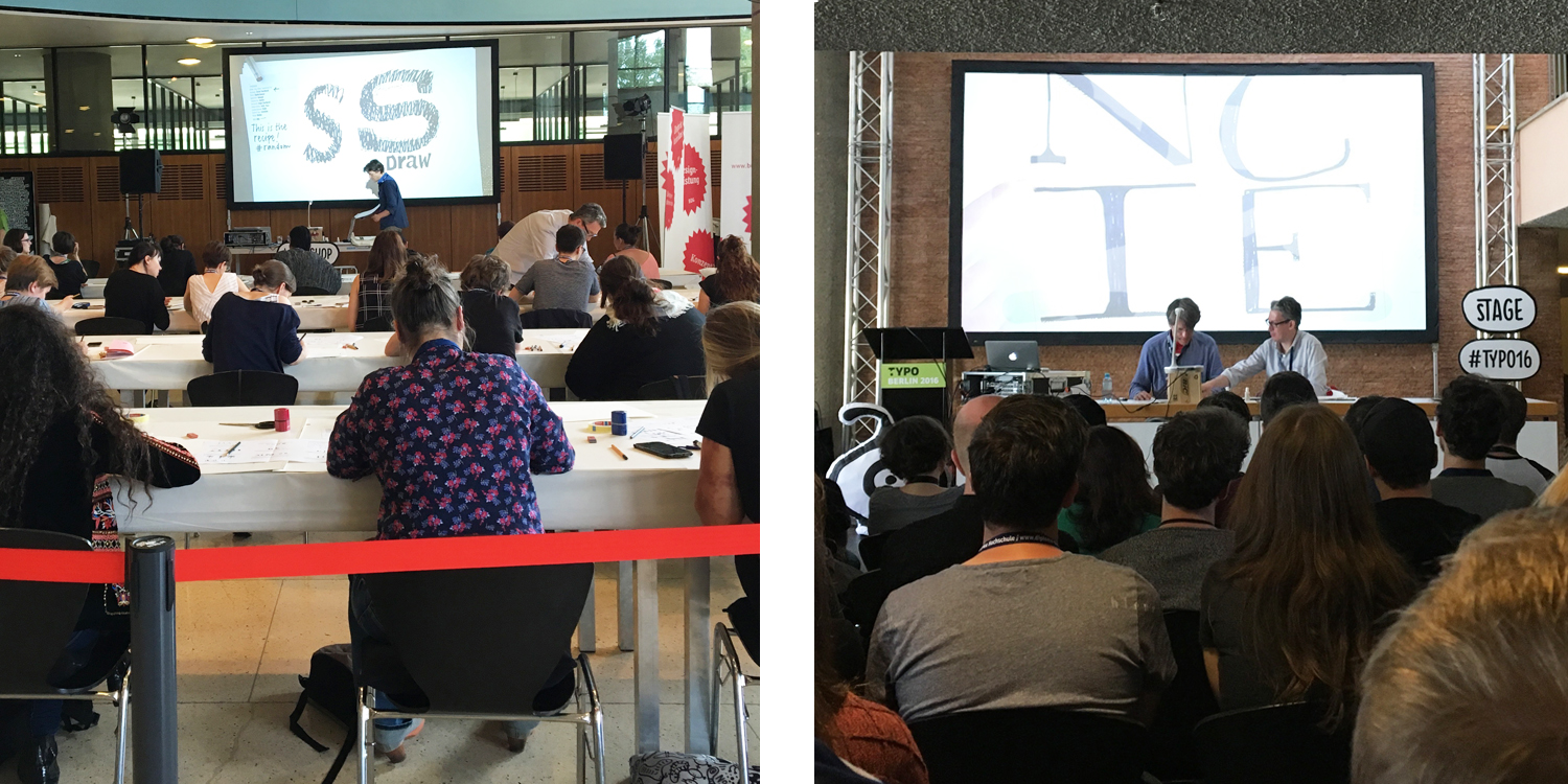
Ridad and I attended the workshop of Tarek Atrissi. He challenged us to design a monogram with a combination of one Latin character and one Arabic character. I choose my initials: the Latin L and the Arabic B. Interesting was that because I don’t know the Arabic alphabet, I started to see the letters as forms. There are many differences between the letters so it’s hard to find a fitting form.
Next Niko Kitsakis was on: How learning Japanese helped me to look at things differently. Niko discussed the differences between the Japanese and English language. English is made up of letters but Japanese contains characters that each have their own meaning. Different characters together make a new word, a new meaning. Think about the word ‘conclusion’. When you read it in English you know what it means but that’s it. In Japanese the word ‘conclusion’ is made out of two characters; ‘tie up’ en ‘argue’. If you tie up argument, you get a conclusion!
During the afternoon rooftop coffee break I met Ridad Alem, a graphic designer from Saudi Arabia. I found it interesting to see that even if you live miles apart and come from totally different cultures, you all have something in common. As Ridad said: “What I love most about the conference is the variety of topics and speakers that come from many disciplines, cultures and backgrounds.” I couldn’t agree more.
Ridad and I attended the workshop of Tarek Atrissi. He challenged us to design a monogram with a combination of one Latin character and one Arabic character. I choose my initials: the Latin L and the Arabic B. Interesting was that because I don’t know the Arabic alphabet, I started to see the letters as forms. There are many differences between the letters so it’s hard to find a fitting form.
Day 2
Erik Marinovich opened the day with: Lettering in the age of Hip Hop. His introduction was a short movie with all kinds of different hip hop songs and suitable typographic images. Hip hop and typography have a lot in common. Just like a hip hop crew, you can do more and better typography if you work together. Erik has his own crew: Friends of Type, which is a platform for him to experiment and promote his work. You could say that typography, just like hip hop, is part of everyday life. Ridad commented: “Erik taught me how to be inspired from my interests outside of my work as a graphic designer, and use that inspiration to improve myself and my projects. It also taught me that personal projects are just as important as client work.”
Menno Cruijsen, creative director at Lava, started his talk with a short introduction about Lava. He took us on a journey through the creative process. Interesting about this lecture was that he showed us there are no boundaries in being a designer. When you want to go to China and make logos for the local companies you should, no one is stopping you.
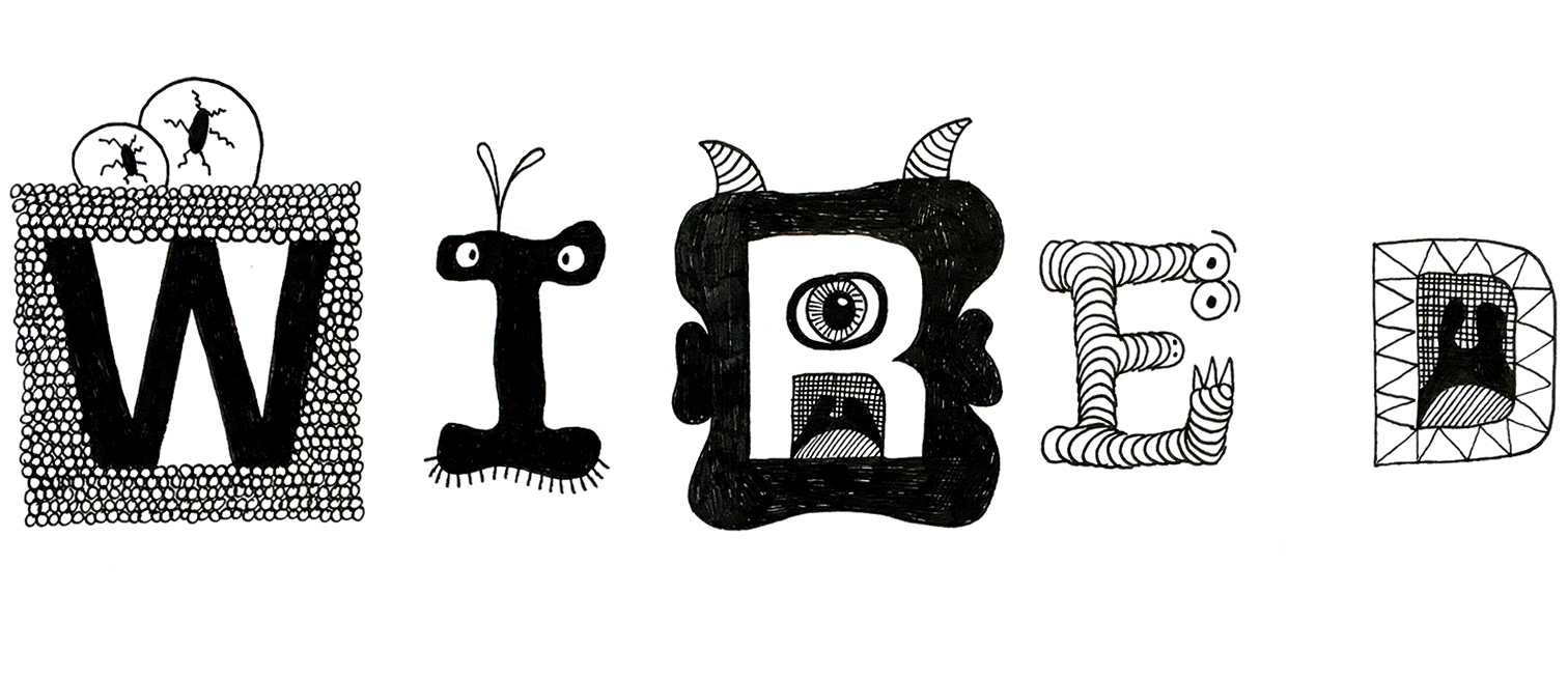
After lunch I attended Sasha Prood’s workshop: Letter as object – conceptualising & sketching representational letterforms. She showed examples of different ways to start sketching. During the workshop we created a typographic illustration of the word WIRED, where the letters would be little illustrations. It was a fun workshop to be creative instead of listening to and learning from other creative people.
Audiovisual design agency Field opened their presentation with an impressive showreel. According to their talk every creative person goes through different emotions while working on their projects.
Attitude: the moment you got the project. You can beat the world!
Confusion: what does the project really mean and what are you really doing?
Inspiration: not the kind you find on Tumblr or Pinterest.
Excitement: sometimes your idea is so big you just want to start right away.
Ignorance: the pressure of a project becomes too much but you won’t give up.
Fear: not a bad thing.
Admiration: Marcus was wondering, if people don’t recognise me as an artist, what am I doing it for?
Courage: have the balls to show your work to the bigger audience. Eventually they will recognise you.
Last tip Field gave us: when you get a briefing, don’t read the specifications: they will only limit your ideas. Read them afterwards and adjust your project or convince the client of your idea.
Day 3 - last day
Matteo Bologna showed us a way of working by setting rules for yourself. He chose different fonts and gave these a limited size so he could only use the font by that size. He did this because it is similar to the way people worked on the letterpress. Research our history and use it in your work. But also: “Screw research—it works if it looks right”.
Next I saw Yuliana Gorkorov, she discussed the global alphabet she created. The alphabet is readable in Arabic, Russian, Hebrews, English and German. The alphabet consists of icons which you can read if you take every first letter of the icon. The first letter of the icon is in every alphabet the same letter but it will be written by sound, not by writing. So you can read it in every language without having to think about the correct spelling. Yuliana gave us a test so we could read it ourselves. It surprised me how easy and fast you can read it when your brain has figured it out. Yuliana’s dream was to create this alphabet. When you believe in something it is possible.
According to Erik Spiekermann, Tobias Frere-Jonas is: “One of the best living type designers”. Tobias started his talk with a few important moments in the history of typography including the rise of the use of displays. He also showed examples of why there are so many typefaces and why there aren’t already enough. Typefaces are a solution for design problems. Think about the new technology, smart watches etc. make sure that we need to make new fonts with all new specifications to contain the readability.
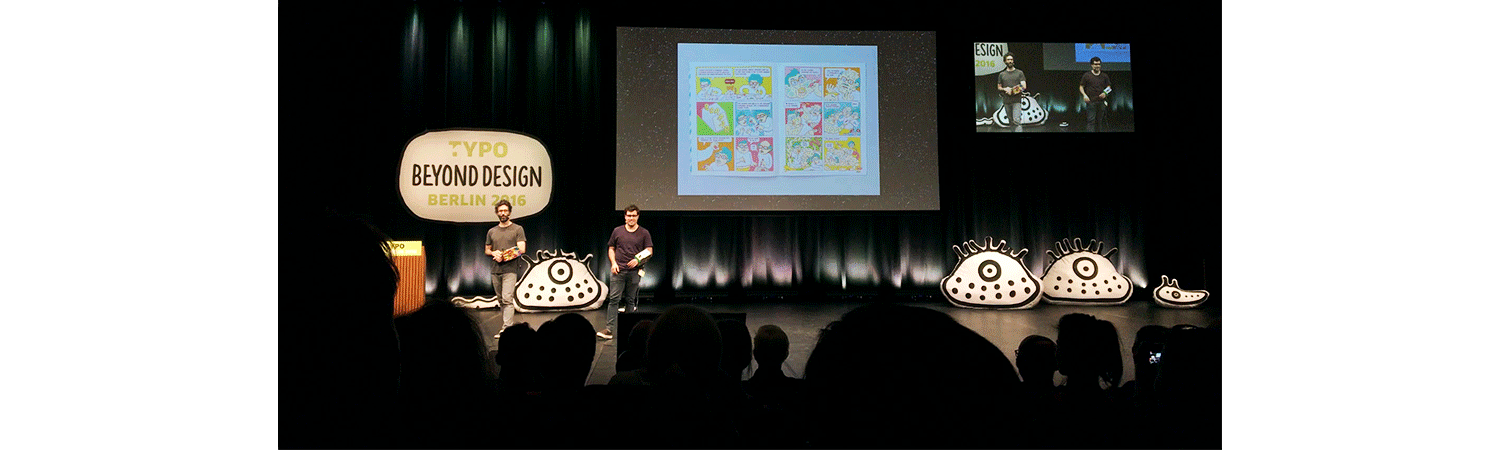
Lastly I saw a talk by Brosmind. The brothers showed that life as a designer / illustrator is as fun as you want it to be. Their presentation was a party in itself. They took us on a journey through their youth, their connection as brothers and their work. The most important message was: don’t limit yourself as it comes to crazy ideas that need a lot of money but find a solution so you could make these ideas reality. Nothing is impossible as long as you love what you do.
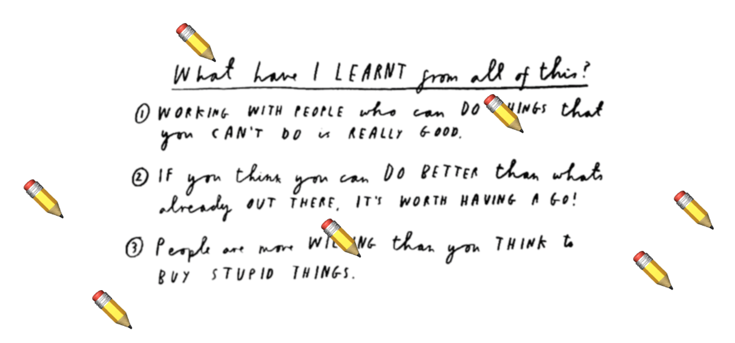
Personally I have learnt that I don't have to be afraid to visit unknown places. Attending a conference alone gave me the opportunity to make up my own opinion and meet really great people. Berlin is definitely a city I would love to go back to.
As a designer I have learnt that working together is very important. When more eyes see a project it will become better. Keep the fun in your work. Chase your dreams and work on projects you like.
If you ever feel the need to have some fresh inspiration a conference like this is a good place to visit. Some of the amazing talks were filmed. You can watch them here! I would definitely join next year and if you’re interested in design and typography you should too! Next TYPO Berlin is from 25 till 27 May, 2017.
Lotte Broeren, graphic design student at AKV|St.Joost 's Hertogenbosch, Netherlands.
📬
Get the latest design conference news
in your inbox!
Join over 2,000 readers and receive a curated mix of upcoming events, inspirational talks, and links at the intersection of tech, design, and culture every Monday.