Visualized Milan, a day full of data, storytelling and design
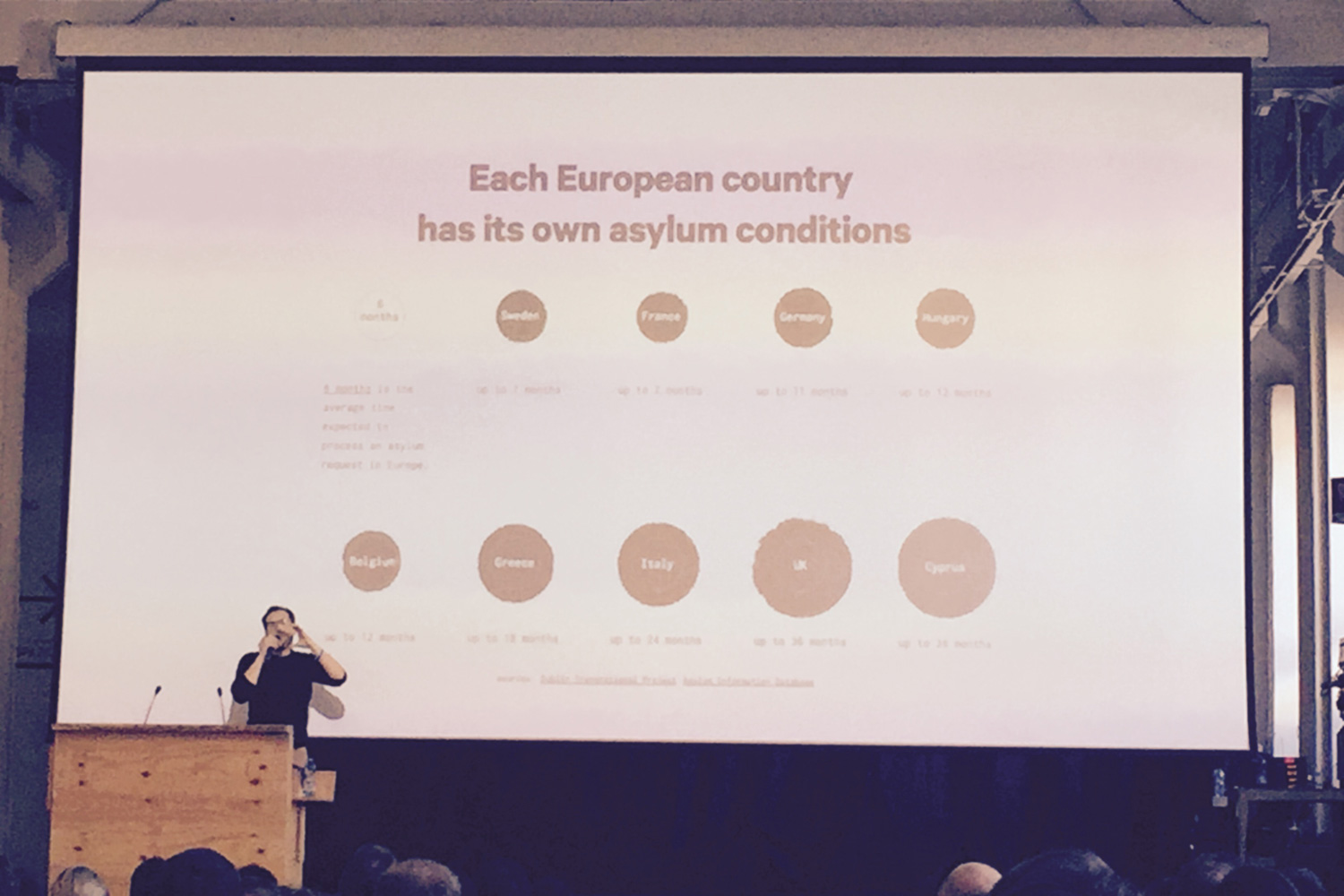
The Europe Dreaming project by reseacher Matteo Moretti about the European dream and the migrant crisis impressed me. The project shows the truth behind the numbers presented by all the official channels, in a very human way. Check out the Europa dreaming website and discover the real facts behind this crisis.
The official part of the day ended with a technical walk through of the WorldPOTUS project by data-driven design firm Accurat for Google News Lab.
Just before lunch Tiziana Alocci and Piero Zagami launched their new magazine Market Cafe Magazine. It's a nicely designed duotone magazine. The zine is about the people working in the data visualization industry. Presenting stories about the ups and downs of working with data. The magazine is self-initiated, self-funded and distributed. The first edition only has 500 copies, so get yours before the sell out at their shop!
To come back on the how the day was set up. The day started with relatively fast and visual strong presentations. As the day evolved the projects became more and more political. Which does not mean visually boring or hard to understand, in the contrary. The quality of all presentations was high, visually very appealing and well presented. Instead of having a closing reception, all attendees were invited to attend the concert by Brazilian artist Dillion, later that night in the same venue.
Visualized Milan was a really nice and friendly experience. The opening reception hosted by branding agency Inarea was relaxed and charming. The day itself was well curated, inspiring, and presented me alternative ways to look at the world. The presentations gave me new insights in the tremendous possibilities and power you have and get by visualizing data. The influence data visualizing can have on a community by making the invisible visible is enormous and is something that I have research more.
Maral and Piero are on top of the game and very committed to the data viz community. They have a open and pleasent way of presenting. Each speaker got introduced with a nice personal touch.
During the events I met so many awesome people from the global data viz community, which made the expierence even more exiting! I don't know yet when the next Visualized is but if you have the change to go, GO!
Thank you Maral for inviting me!
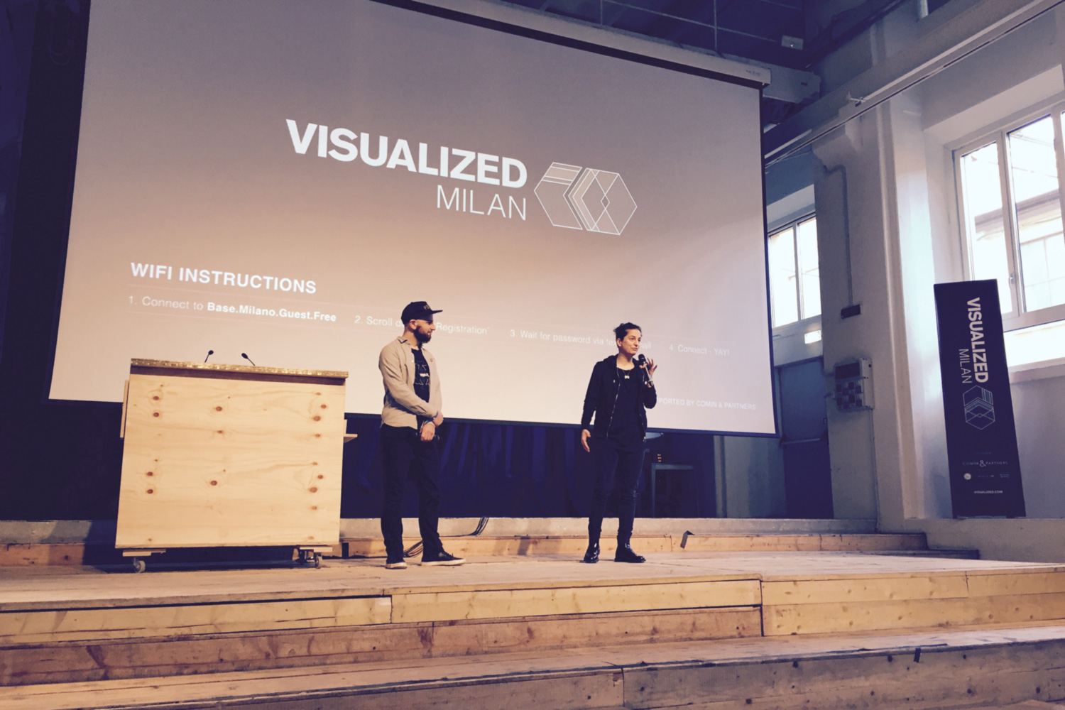
Bringing Visualized to Milan was an idea of Piero Zagami. He contacted Maral Pourkazemi, director of operations at Visualized with his plan. Long story short, great idea let do this! Not a strange thing to say for Maral, since she asked Visualized founder Eric Klotz to bring the conference to Berlin. After been a speaker herself at the first edition in New York. More about how Maral became an event organizer you can hear in my interview with her for The Neon Moiré Show, our podcast serie.
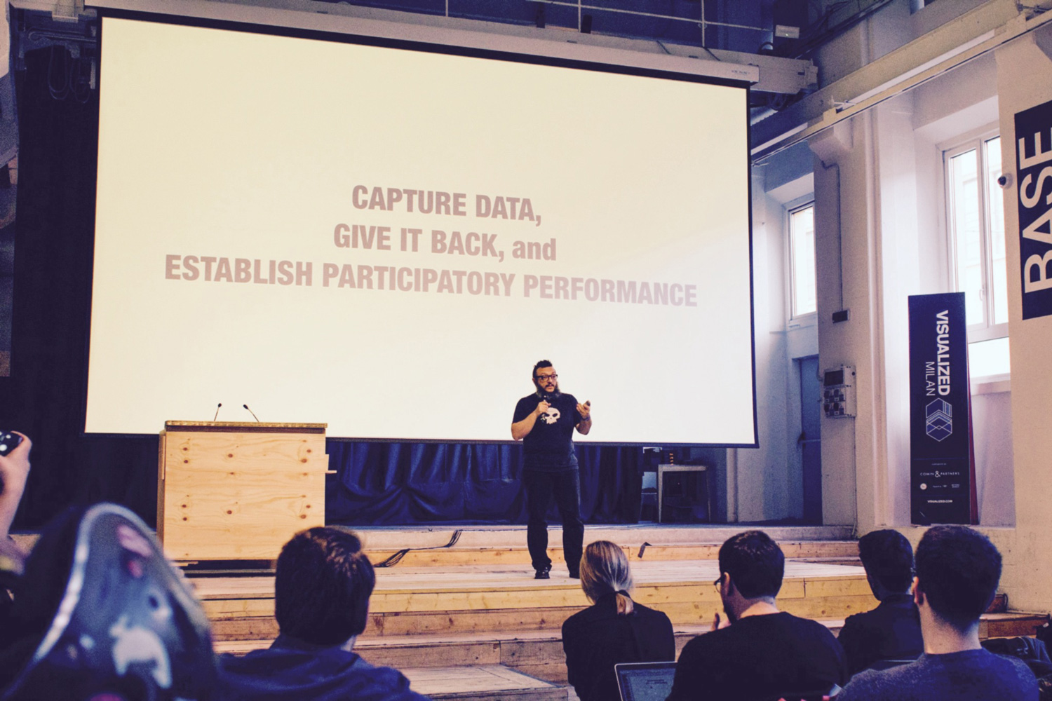
The day started with a presentation by engineer/artist/hacker Salvatore Iaconesi of Human EcoSystem. In his talk he presented their latest project: Sound of Milan (SoMI). The project is an web application that shows in realtime the music taste of the Milan population, by scanning social media outlets. By doing that SoMI creates a minute by minute updates city-generated Hit-Parade! Later this month we will publish our interview with Human EcoSystem and Base Milano about this project and their collaboration. In this podcast we dive deep into the background, techniques and future of this project.
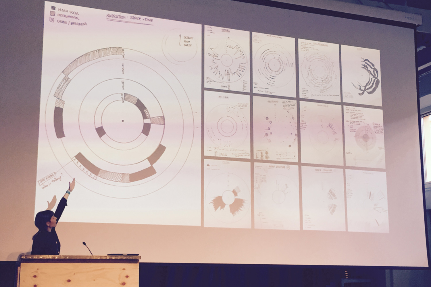
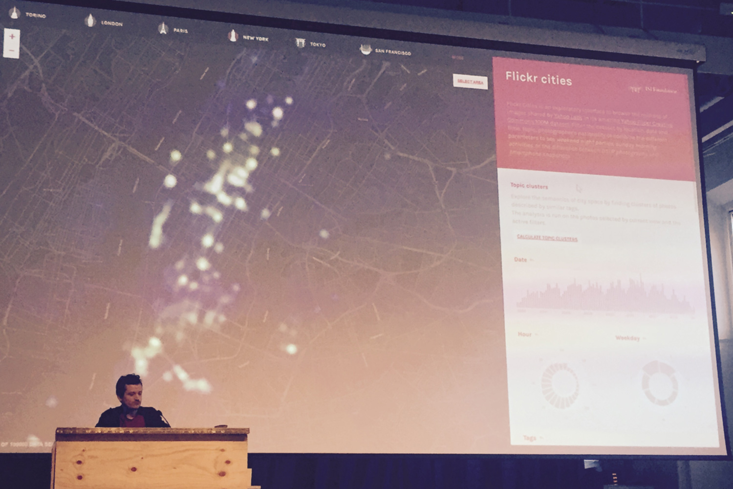
Other presented projects that stood out for me were the Oddityviz by designer Valentina D’Efilippo, a visual deconstruction of David Bowie’s song Space Oddity. The Flickr Cities project by Marco Quaggiotto of DataInterfaces. DataInterfaces is an experimental laboratory at University Polytechnic di Milano. Flickr Cities is an app that provide you an easy way to browse through millions of Flickr photo's. These pictures taken by thousands of users in a period of eight years let you discover new and popular places in seven major cities around the world.
📬
Get the latest design conference news
in your inbox!
Join over 2,000 readers and receive a curated mix of upcoming events, inspirational talks, and links at the intersection of tech, design, and culture every Monday.